
A brand identity has to work in more places than ever: a tiny circle on Instagram, a favicon in a browser tab, a WhatsApp profile, a printed menu, a standee at an exhibition stall, a delivery bag, a shop sign seen from across the road. A logo designed to look good on one presentation slide often falls apart in half of these. The answer is to design a system, not a single mark.
Identity is a system, not a logo
The logo is the most visible part of an identity, but it is only one part. A complete identity is a small set of decisions that, used together, make everything you publish recognisably yours — even when the logo is not on it.
- A logo in several versions: full, compact and a standalone mark.
- A colour palette with clear roles, not just a list of colours.
- One or two typefaces, with rules for headings and body text.
- A photography and illustration style.
- A tone of voice for how the brand writes and speaks.
Design for the smallest place first
The hardest test for a logo is the smallest space it has to work in. Shrink it to the size of a profile picture or a favicon and see what survives. Fine lines disappear, small text becomes a blur, and detailed illustrations turn into a smudge.
This is why strong identities have a simple mark that works on its own — a symbol or a single letterform — alongside the full logo. Use the full version where there is room, and the mark where there is not. Check, too, that it reads in one colour, because embroidery, stamps, engraving and cheap printing will not always reproduce your gradients.
Give every colour a job
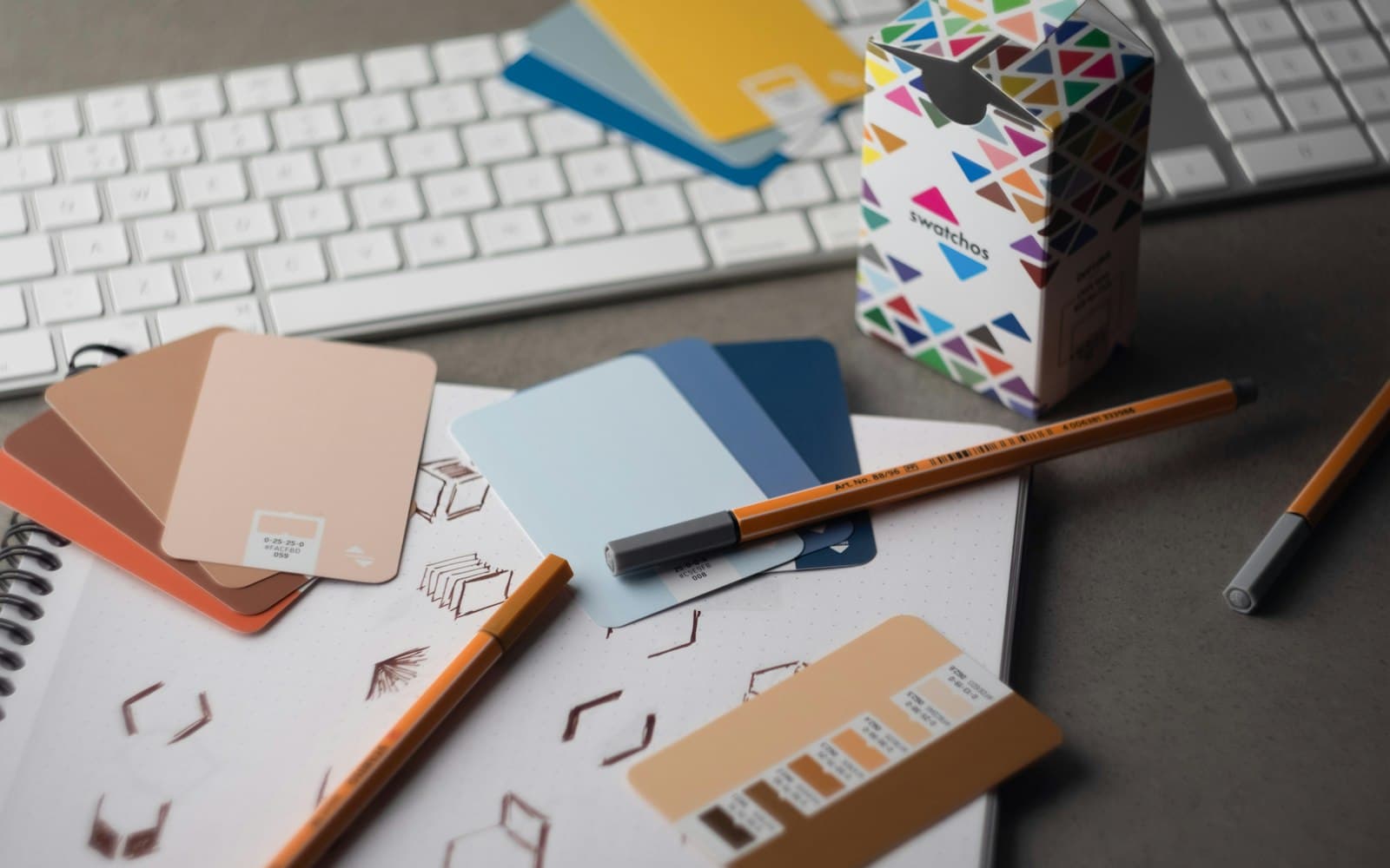
A palette is far more useful when each colour has a defined role. One primary colour that people associate with you. One or two supporting colours. Neutrals for backgrounds and text. And a clear rule for which colour is used for buttons and calls to action.
Check contrast early. A pale colour that looks elegant on a mood board can be unreadable as text, both on screen and from a distance on a sign. Good contrast is what makes a brand legible — and accessible to everyone who reads it.
Plan for two scripts
Many Nepali brands appear in both English and Devanagari — on signage, packaging, festival campaigns and social posts. Choose a Devanagari typeface that sits comfortably beside your Latin one in weight and character, and decide in advance how the two are arranged together. Brands that skip this end up with a carefully designed English logo next to Nepali text set in whatever font was installed on the designer's computer that day.
Screen and print are different worlds
Colours on screen are made of light; colours in print are made of ink, and the same value can look noticeably different on paper. Define your colours for both — RGB or hex values for digital, CMYK or Pantone references for print — and order proofs before a large print run. Large-format work such as standees, stall backdrops and shop signs also needs files prepared at the right size and resolution, with text kept back from the edges where it might be trimmed or folded.
Before a big print order, print one sample at actual size and look at it from the distance people will see it. A sign that reads perfectly on a laptop can be illegible from across the street.
Templates keep the system alive
Even the best identity drifts when every new post or poster is improvised. The fix is a set of templates: social posts and stories, ad formats, presentation slides, price lists, invoices and email signatures. Templates let anyone on the team — or a new agency — produce work that looks consistent, without needing to reinterpret the brand each time.
Write it down
An identity that only exists in the designer's head leaves with the designer. Capture it in a short brand guide: the logo versions and when to use each, clear-space and minimum sizes, the colour values, the typefaces, examples of the right photography, a few lines on tone of voice, and examples of what not to do. It does not need to be long. One clear document saves endless arguments later.
A checklist for an identity that travels
- A simple mark that works at favicon size and in one colour.
- Full, compact and mark-only versions of the logo.
- A palette with defined roles and checked contrast.
- Latin and Devanagari typefaces chosen to work together.
- Colours specified for both screen and print.
- Templates for the formats you publish most often.
- A short written brand guide.
Build the system once and every post, package and sign afterwards becomes easier, faster and more consistent. That consistency is what turns a logo people have seen into a brand people recognise.
All marketing articles